
Market City Signage and Wayfinding
A refreshed signage system for a well-known shopping destination in Sydney’s Chinatown.
With a major new dining precinct about to launch, Market City needed a full signage refresh fast. The existing brand guidelines were outdated, and the entire system had to be designed from scratch under a tight two-week timeline. Without a formal style guide, we were tasked with developing a visual approach that would unify three levels of directional signage and promotional messaging across the centre.


Approach
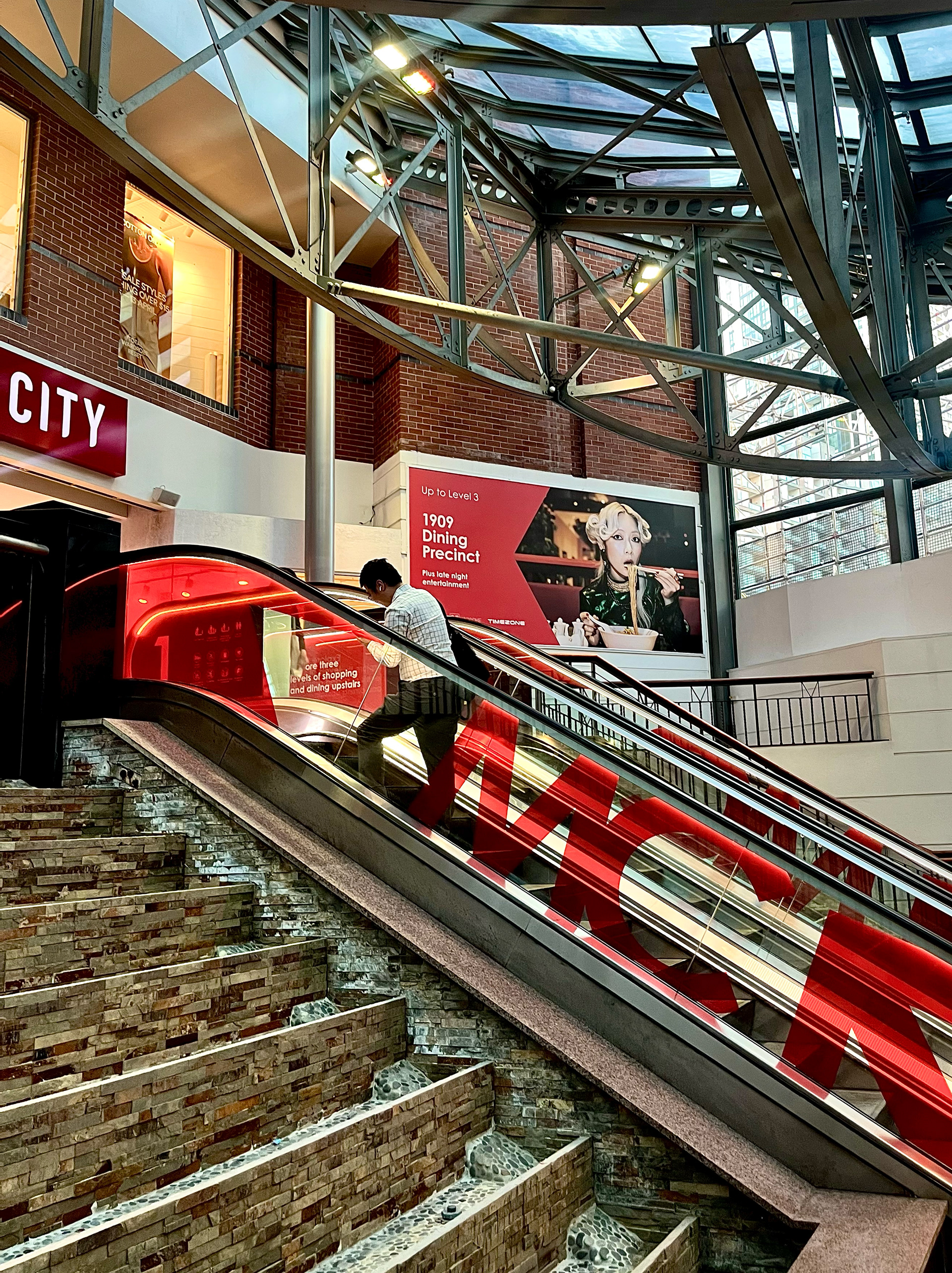
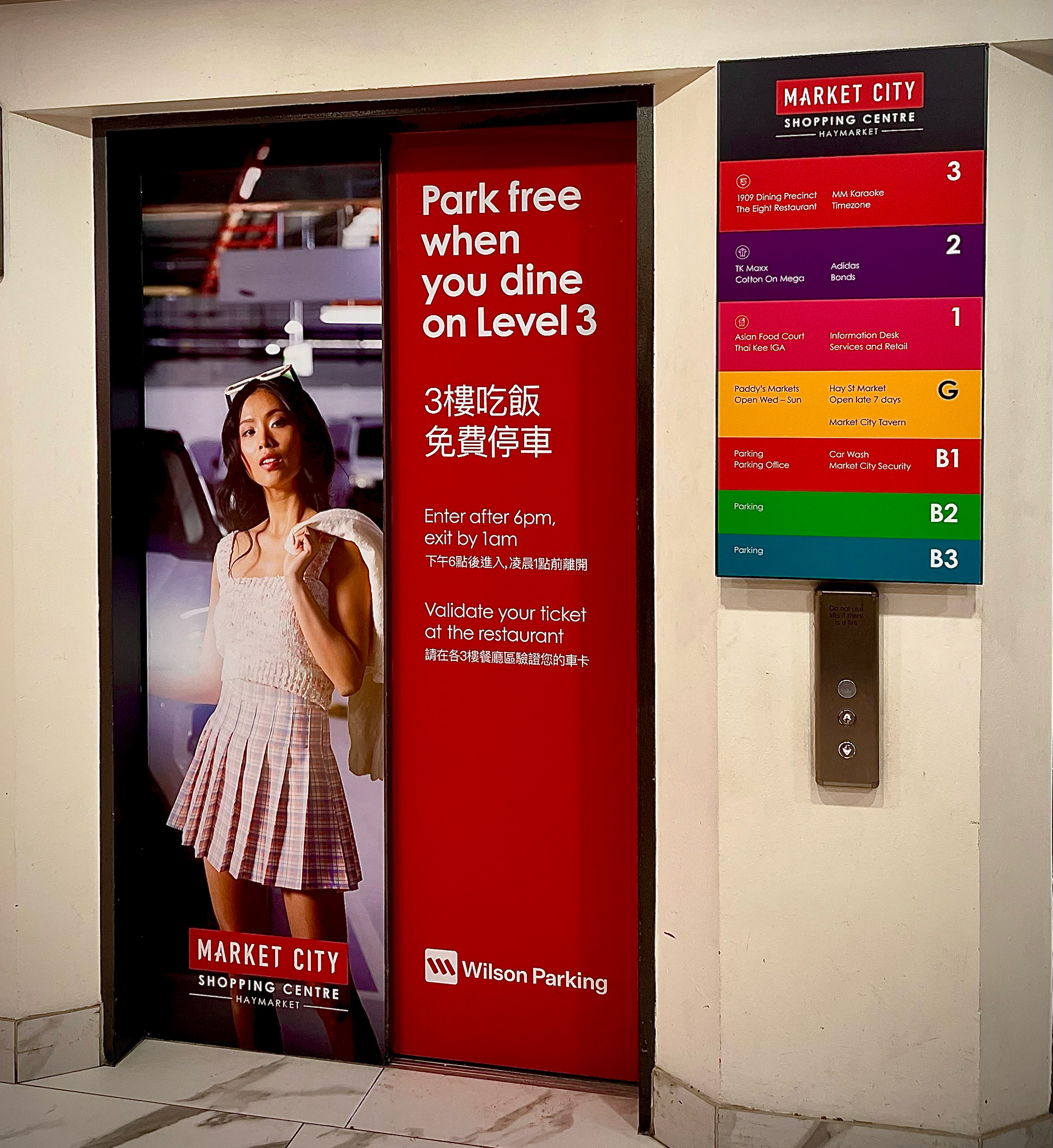
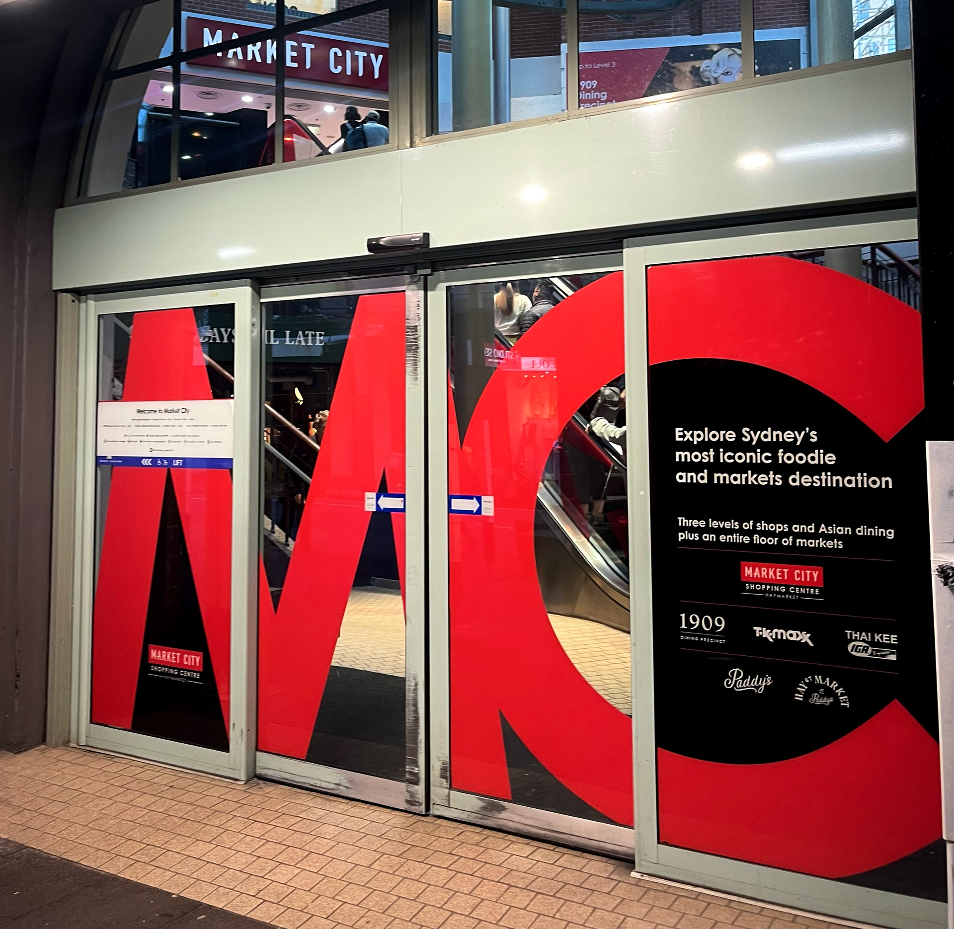
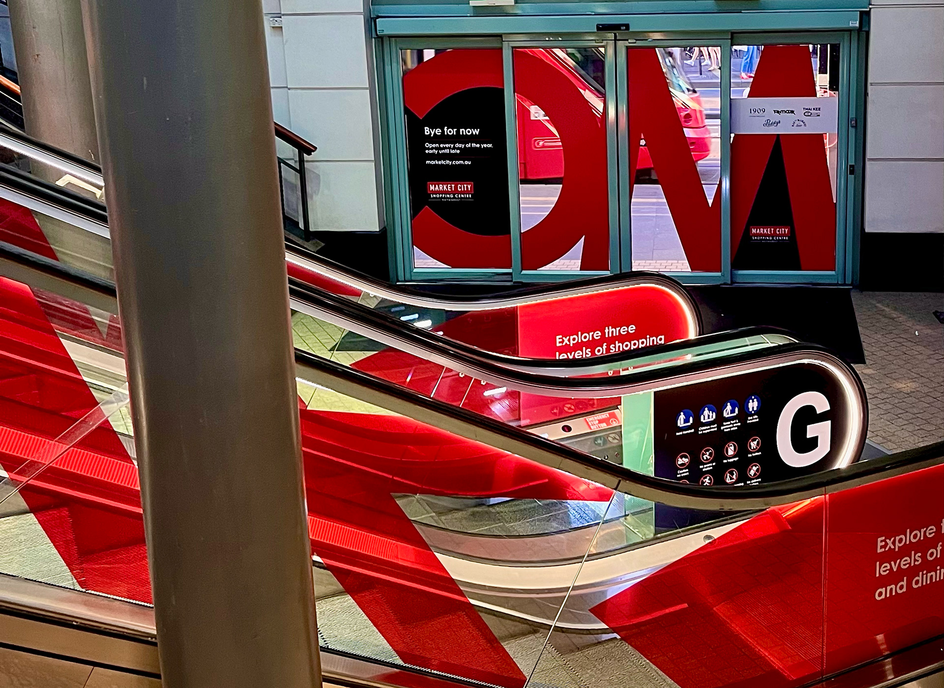
Alongside the creative team, I met with the marketing manager on-site to map out signage opportunities across key touch points. The project covered sliding door decals, escalator wraps, lift directories, billboard signage, and in-centre wayfinding including car park and entry light boxes. It was as much a print production challenge as a design one, requiring detailed artwork setup with printers to ensure everything was delivered at scale and on time.
My Role
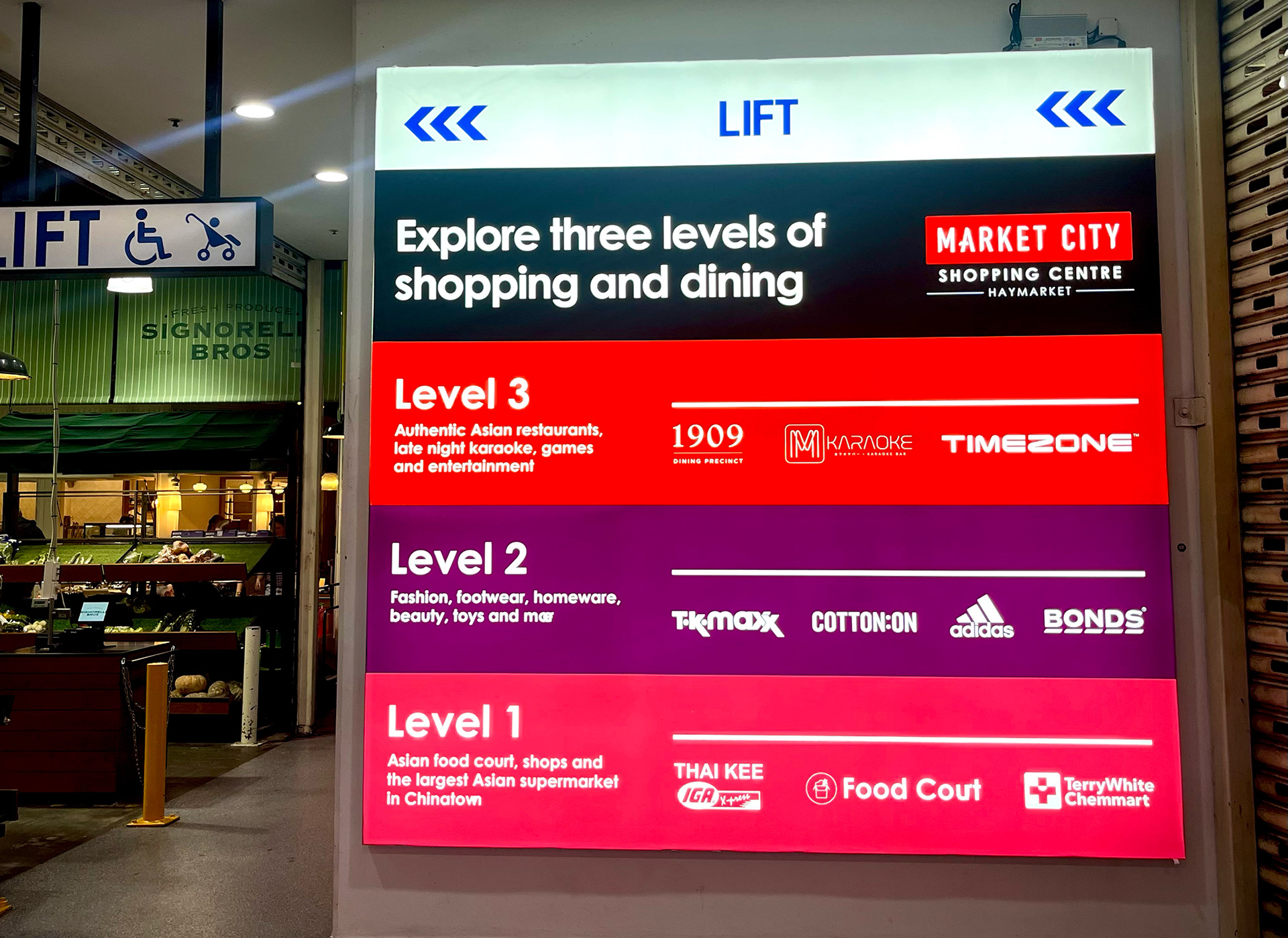
I designed the full suite of signage using a refined palette built around the brand’s signature red. We paired it with a bold, cropped “MC” typographic device and directional colour coding to guide visitors. I also prepared and delivered all print-ready artwork for the centre and external suppliers.
I designed the full suite of signage using a refined palette built around the brand’s signature red. We paired it with a bold, cropped “MC” typographic device and directional colour coding to guide visitors. I also prepared and delivered all print-ready artwork for the centre and external suppliers.
Outcome
The new signage system brought clarity, consistency, and energy to the space launching ahead of schedule and helping Market City deliver a strong first impression for new and returning visitors.
The new signage system brought clarity, consistency, and energy to the space launching ahead of schedule and helping Market City deliver a strong first impression for new and returning visitors.
Scope
Four sets of sliding door decals
Three levels of lift decals
Lift directories
VMO Screens
Escalator decals
Billboard signage
Car park signage
Entry Light-box
Map signage
Credits
Bastian Storch, Creative Director
Emily Newberry, Copy Creative Director
Four sets of sliding door decals
Three levels of lift decals
Lift directories
VMO Screens
Escalator decals
Billboard signage
Car park signage
Entry Light-box
Map signage
Credits
Bastian Storch, Creative Director
Emily Newberry, Copy Creative Director