
Castle Eden Property Management
A brand identity that communicates trust, protection, and local roots.
Challenge
Castle Eden is a property management service offering landlords and directors reliable support with a focus on professionalism and security. The founder, Adrian, approached me to create a visual identity that would reflect the company's values, trust, quality, and a strong connection to the local area.


Approach
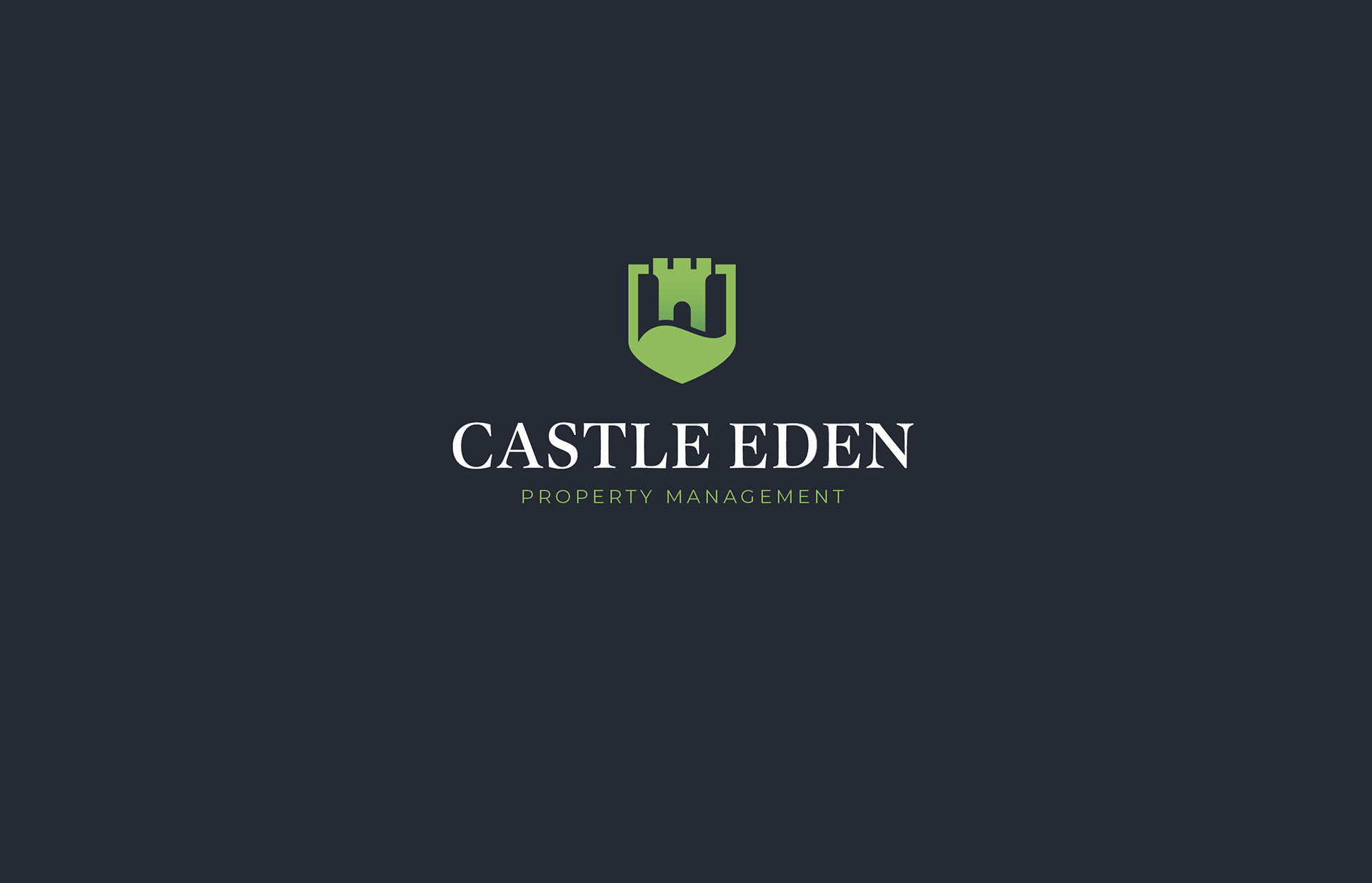
I built the identity around the core idea of protection, drawing from traditional heraldry. The final mark combines a castle, a shield, and a curved river referencing Carlisle Castle, the River Eden, and the company’s name. The result is a mark that feels solid, grounded and approachable. The colour palette was chosen to reflect freshness and dependability, standing out from more corporate competitors.
I built the identity around the core idea of protection, drawing from traditional heraldry. The final mark combines a castle, a shield, and a curved river referencing Carlisle Castle, the River Eden, and the company’s name. The result is a mark that feels solid, grounded and approachable. The colour palette was chosen to reflect freshness and dependability, standing out from more corporate competitors.

My Role
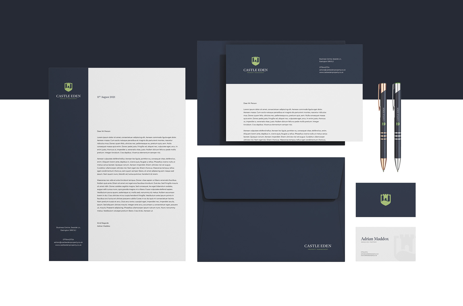
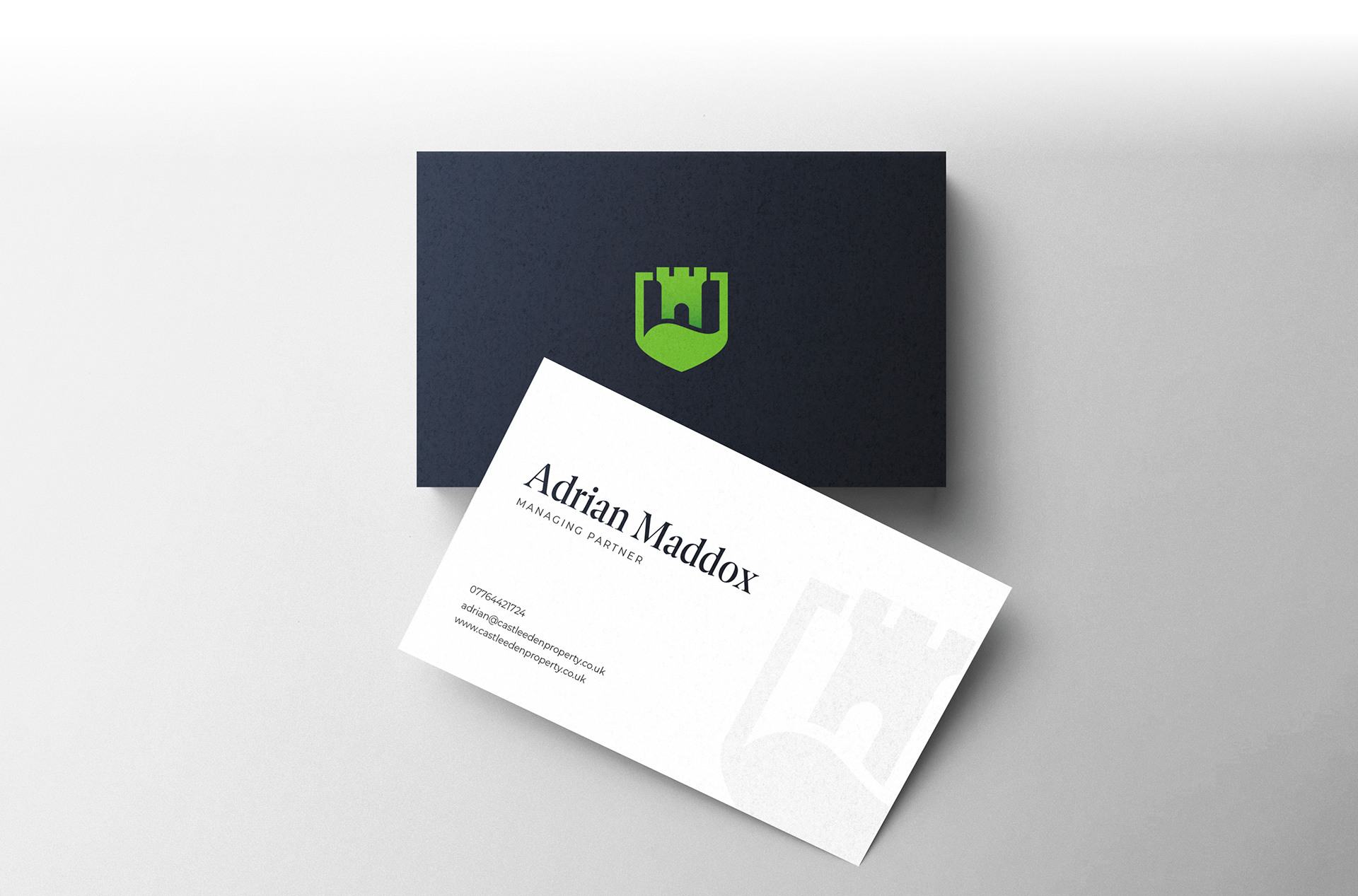
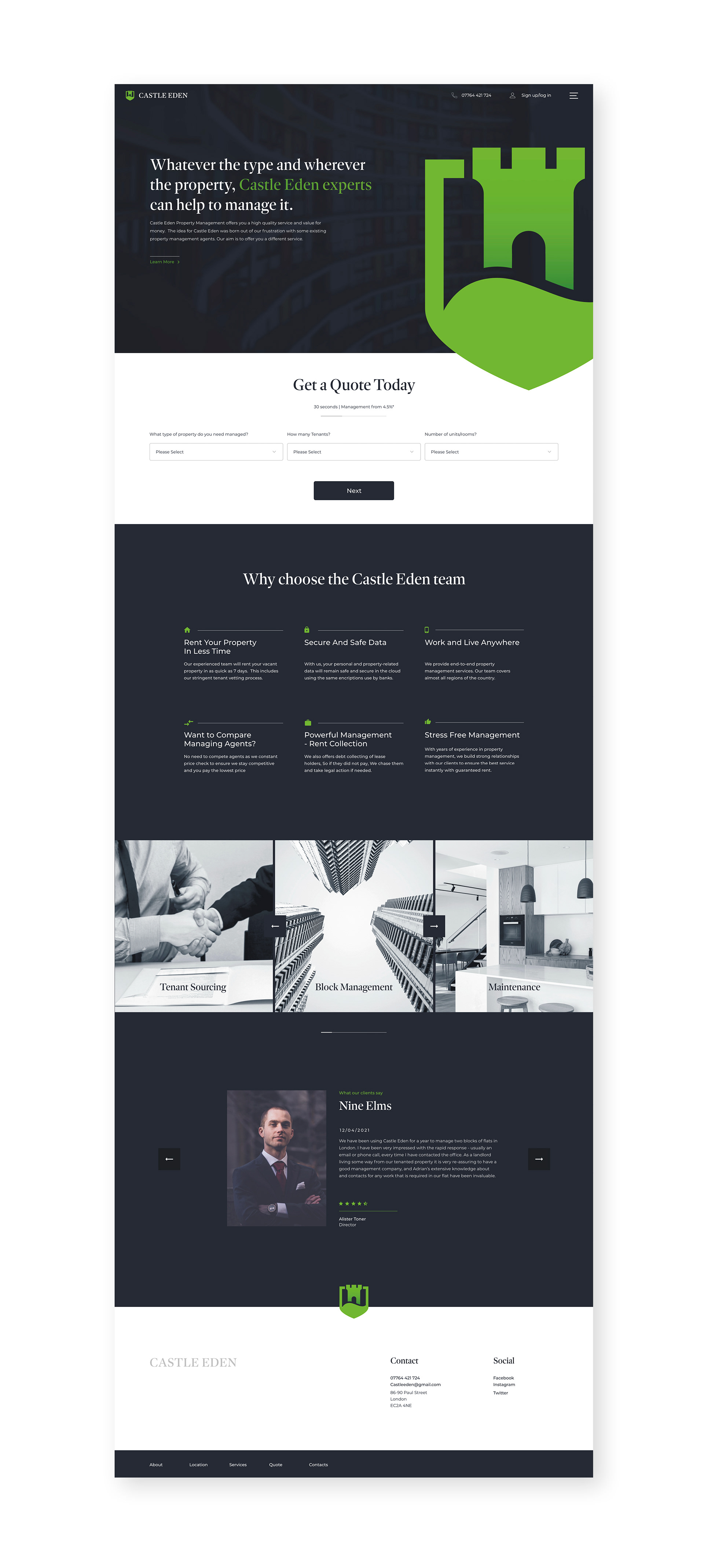
I developed the full brand identity and supporting system, including typography, colour, and logo application. I designed marketing materials, business cards, stationery, uniforms and mugs, and worked on the visual design of a responsive landing page for client enquiries and quotes.
I developed the full brand identity and supporting system, including typography, colour, and logo application. I designed marketing materials, business cards, stationery, uniforms and mugs, and worked on the visual design of a responsive landing page for client enquiries and quotes.
Outcome
The final brand successfully captured Castle Eden’s personality and ambitions. Adrian described it as a “perfect representation” of the company’s ethos. The new identity now appears across digital, print, and physical touchpoints, bringing a sense of credibility and cohesion to the growing business.
The final brand successfully captured Castle Eden’s personality and ambitions. Adrian described it as a “perfect representation” of the company’s ethos. The new identity now appears across digital, print, and physical touchpoints, bringing a sense of credibility and cohesion to the growing business.